In this article, we provide you with an overview of the study led by our Head of UX Research, Eduard Kuric, using UXtweak UX research tools aimed at finding the final answers to the following questions:
- What does a good, clear, readable toggle button look like?
- What visual characteristics of a toggle button make it error-proof and prevent user confusion and frustration?
This article contains an overview of our comprehensive 2 part case study published in Smashing Magazine. The overview brings simplified outcomes, new graphs, and toggle button design guidelines you should base your designs on.
If you rather see the detailed case study, read Part 1, and Part 2 in Smashing Magazine.
First, let me answer a few questions about the toggle button (toggles) and then discuss our research.
Want to see the research findings right away? Click here
Want to skip ahead to Toggle Button Design Guidelines? Click here.
What is a Toggle button?
A toggle button is a control used for switching (or toggling) between two or more states or options. Both its name and function are part of a skeuomorphic metaphor, meaning they’re based on something more familiar and older. In this case, the electrical switch.
When should you use toggle buttons?
The toggle button should only be used as a control when there is an immediate effect, without hitting Save, Submit, or any other input. Apply them only when the setting has a default value. In other cases, radio buttons or checkboxes may be the better option.
Toggle button vs toggle switch
There are two ways to use a toggle-type element. For binary options (mostly on/off) you should go with a toggle switch. The toggle switch is very simple, it lets you activate or deactivate a function. A toggle button is suitable for switching between opposing (even multiple) options. It’s composed of two or even more buttons next to each other. The selected button needs to “highlight” in some manner to signify the toggled (active) state.
Research on effective toggle button design
Since toggle buttons don’t contain text on/off, users have to rely on other visual cues when reading toggle buttons. Which, when not used correctly, can do more harm than good. Picking the right visual clue is not as trivial as it would seem and if you keep reading, you will find out there is a lot to consider here.
So…
How do you design an effective toggle button?
When designing effective toggle buttons, the goal is to make toggle buttons distinct enough to signal the difference in visual weight between selected and unselected options. At the same time, the buttons should be alike enough to be viewed as two (or more) parts of the same whole. The challenge is to make it clear which button is currently active.
With enough experience and usability testing, you can ensure your toggle design won’t be an issue.
But what if you could tell right away what will or won’t work based on comprehensive research and cold hard data?
What design features help users distinguish which toggle option is the active one?
How should you combine visual cues, such as colors, text size, and outlines, to make the state of toggles instantly recognizable?
In our study, we’ve explored the field of visual cues and focused on which design characteristics signal that a button in a toggle pair is active or inactive.
Anatomy of the toggle button
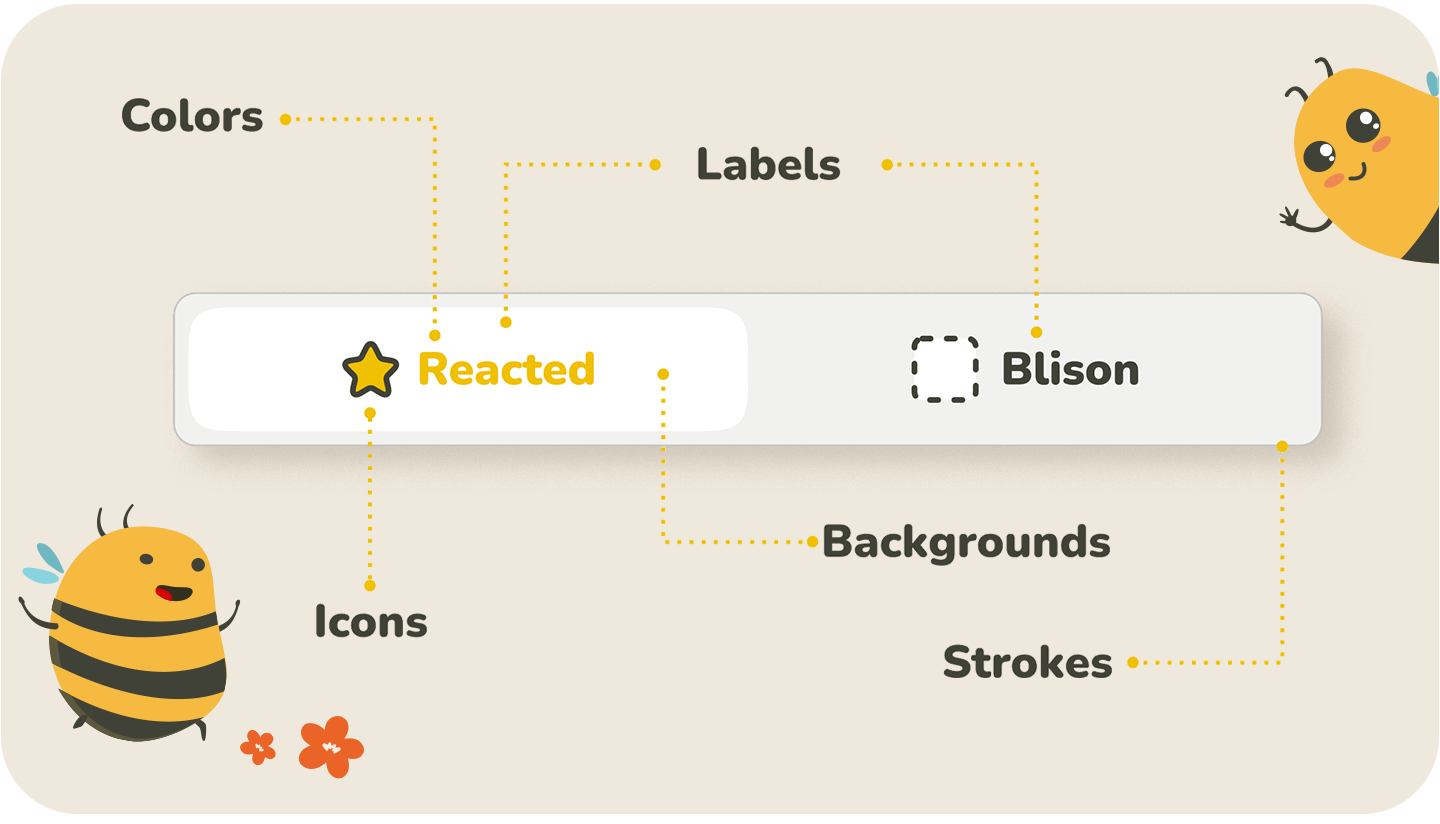
The toggle button usually consists of a combination of labels, filling, outline, and sometimes a specific icon – not all of these components have to be present. Each of them can be emphasized somehow (can be used as a visual cue), and there are many different ways to combine visual cues.
To start from the base, we focused our research on standalone visual cues concerning each of the button’s possible components: label, filling, frame, and icons.
Based on our assumptions of how these components influence the perception of an active/inactive button, we have formulated 17 specific research questions.
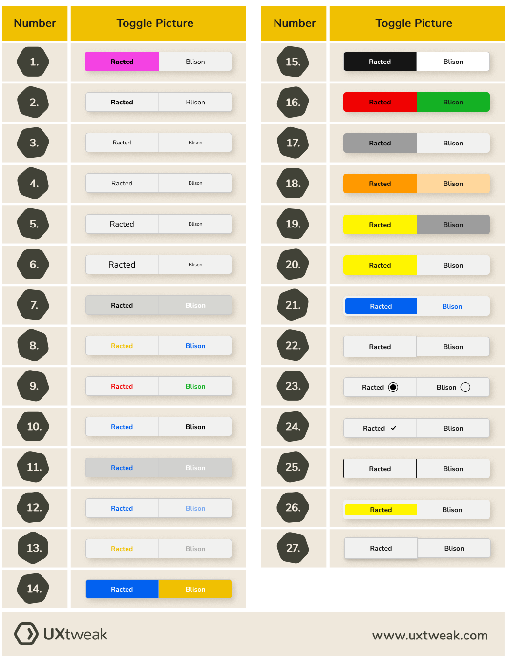
To test our assumptions, we designed a set of toggle buttons that individually represent our research question for visual cues. We used only one visual cue in focus on each toggle button to shape the user’s perception of an in/active state of the button. Therefore, the visual cue is the only thing that differentiates the buttons.

Visual cues we tested
- Bold text
- Text size
- The contrast of inverted colors in text labels
- Red vs. green in text labels (cultural perception)
- Color vs. black/white in text labels
- Primary color vs. neutral colors (shades of gray) in text labels
- Different saturation of the same color in text labels
- The contrast of inverted colors in the background
- Cultural perception of red and green in the background
- Different saturations of the same color in the background
- Saturated and grayscale colors in the background
- Inverted design of buttons
- Highlighted outline of the active button
- The inactive button coincides with the background
- Embossed vs. debossed button
- Check sign
- Radio button
List of the toggles we designed to test the visual cues

We tested which of the cues work better than others, which are the best, which are the worst, and why. Later on, we combined this information into a list of best practices for creating optimal toggle buttons.
How did we test the effectiveness of the toggle button variant?
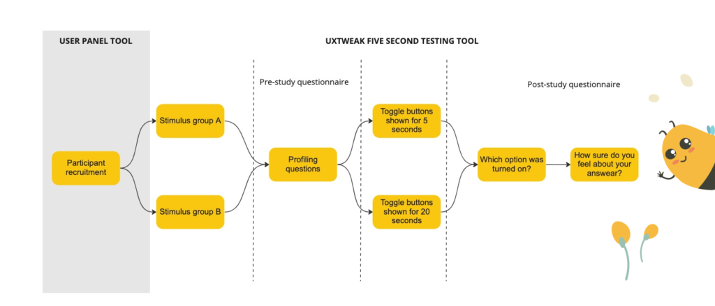
To verify our assumptions and gather a good amount of hard data – we prepared a plan for the research and decided to use two different setups of UXtweak’s Five Second Testing tool.
In the first setup, we showed the toggles to one group of participants for 5 seconds and then to another group for 20 seconds. After we showed the toggle to participants, we had them fill out a few questions aimed at finding out their confidence in the answer they provided.
Simplified Study Design
Study Participants
We used UXtweak’s User Panel to recruit over 100 people, aged 16 to 75 years old, from English-speaking countries (Canada, the USA, Great Britain, and Australia).
To get more detailed information about our research questions click here.
How did we determine the winning toggle button design?
We were looking at two metrics: Success-Confidence Score and Error Rate.
Success-Confidence Score
To objectively evaluate toggles, we created a weighted metric, which we named the Success-Confidence score. The Success-Confidence score was derived from the number of correct answers (according to expectations) combined with the Likert scale answers to the question: “How sure do you feel about your answer?”
We calculated the average confidence for correct and incorrect answers separately and for every toggle. Average confidence can range from 0 to 1 based on how participants answered the Likert scale question. For example, if all respondents who chose the correct toggle side were to respond with “Absolutely sure” on the Likert, the average confidence for the correct answers for the given toggle would be 1.
Success-Confidence score = (correct_num * correct_conf) – (incorrect_num * incorrect_conf)
correct_num -> number of correct answers
incorrect_num -> number of incorrect answers for toggle
correct_conf -> average confidence with correct answers
incorrect_conf -> average confidence with incorrect answers
We had different numbers of participants available for each test, therefore, we normalized the Success-Confidence score by dividing it by the total number of participants for the given test. Resulting in the following formula:
Normalized Success-Confidence score = Success-Confidence score/number of participants
The scale of the normalized Success-Confidence score is -1 to 1. Minus 1 designates a toggle where every participant provided a wrong answer with high confidence, and 1 designates a toggle where all respondents answered correctly with high confidence.
More about how we evaluated the cues can be found in: Metric for comparing the utility of visual cues
Results of the study – Worst and best toggles
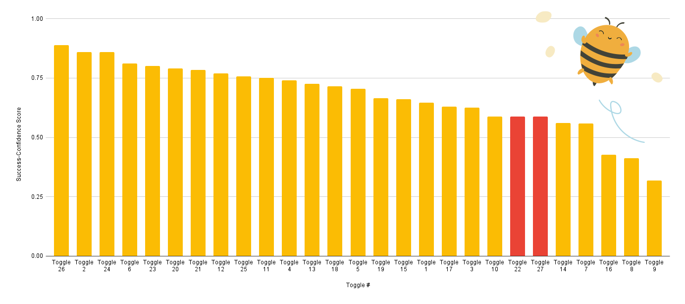
Below you can find graphs showing how each visual cue ended up according to our normalized Success-Confidence Score (the higher the score, the more effective toggle).
Visual cues by Success-Confidence Score
The best performance was achieved by the Toggle 26. The toggles 22 and 27 are highlighted, because we have inverted their scores. Originally they were the only toggles that scored below 0 (both with -0,587). However, all respondents consistently chose the wrong answer. This means that the ability of the toggle to represent which side is active was good enough, however, it was mapped opposite to what respondents expected. In other words, these toggles work just fine, all you need to do is switch the states.
Visual cues by error rates
Here are our toggle buttons by error rates – the lower the score, the better.
As we can see Toggle 26 performed the best by the error rate alone as well. The problematic toggles 22 and 27 had by far the highest error rate. But if we were to invert it similarly to the success-confidence score, their performance would be closer to average with error rates of 0,167.
Let’s move on to our list of the worst and best toggles.
Worst Toggles
Third last place — Red & Green Text Labels
Average rank: 24.67
Combined rank: 25
Succes-Confidence Score: 0.3193

Second last place — Embossed button (no shadow version)
Average rank: 26.33
Combined rank: 26
Success-Confidence Score: -0.5877

Last place — Embossed button (shadow version)
Average rank: 26.67
Combined rank: 27
Success-Confidence Score: -0.5877

Best Toggles
Third place winner — Bold text
Average rank: 2.67
Combined rank: 2
Success-Confidence Score: 0.8597

Second place winner — Check sign
Average rank: 2.33
Combined rank: 3
Success-Confidence Score: 0.8597

First place winner — Inactive button coincides with the background
Average rank: 1.33
Combined rank: 1
Success-Confidence Score: 0.8895

Main findings of the study
Here are some of the main points we arrived at that you should keep in mind when designing your toggle buttons:
Color
- If you choose to use color as the main lead, we suggest using a combination of saturated lively color (ideally corresponding with your CTA color scheme) and a light grayscale neutral color. Having the color in the toggle’s background fill is preferable to using colored text in labels. If the color of the inactive button is the same as the surrounding background, this further improves the button’s comprehensibility.
- Contrasting colors of similar visual weight should never be used. Red and green’s cultural perceptions proved not helpful in communicating what’s selected. There are much better ways to do this.
- Be wary of the black-and-white combination. Toggles using this color scheme are the most prone to confusion rooted in the dark/light mode settings.
Font
You may choose a minimalistic path and use the font itself to differentiate between button states. The bold/thin combination is the go-to solution, but you can also use different font sizes. But make sure to differentiate the font sizes well enough. We recommend using font weight or size to support other visual cues as well since it’s a very flexible cue.
Embossment
If you decide to use embossment as the main cue — we (strongly) advise against it. It proved unreliable at communicating the active state of a toggle. Even a simple border was more effective. If you end up using embossed toggles for their visual appeal, we suggest combining embossment with a primary visual cue, like bold text or color fill.
Icons
There’s no shame in using designs that will surely work. A tick or a radio-button icon both performed well. The evident drawback of choosing them is their cumbersome inclusion in the design of your website since radio buttons as UI elements serve a different function from toggles. The ticks could be perceived as outdated. For radio button icons, you might as well use a radio button instead.
NOTE: It is important to mention that, as with all research, our study has its limitations. Most notably, we built our study around the design of the effective button – so it’s visual. But labeling will be crucial for the effectiveness of the toggle buttons, as well – which we have not explored. We discuss the limitations and potential for future research in more detail in Case Study Part 2, section Potential for future research.
Findings that surprised our researchers
I asked our UX researchers what surprised them the most. Here they mention a few cases when their hypothesis turned out to be false, or the study brought unexpected outcomes
“What was kind of stunning is how much difference there was between the regular saturated vs. neutral color cue and the cue where inactive neutral background color also coincides with the background. These cues are very similar, so one could reasonably expect that the contrast of saturated color vs. gray would be a good enough cue and lead to the basically same result. It just shows how there are always details to tune.”
Peter Demcak – Senior UX Researcher, UXtweak
“What surprised me the most was that the red-green color combination was not nearly as clear a cue as one would expect. In most western cultures is the red color a straightforward mark of negative sentiment, in this case, a turned off toggle. Despite this was the red-green color combination one of the three worst-performing toggles. This shows how important it is to test even the designs we are sure will work correctly.”
Marek Strba – UX Researcher, UXtweak
Toggle button best practices
To help you put our findings into practice, we prepared tips and guidelines on designing the toggles according to our research and experience. We also went through the NN/g toggle-switch design guidelines – even though the Nielson Norman Group guidelines talk about toggle switches, some rules are the same for toggle buttons. We covered and explained those rules below.
If you follow these tips, your toggle button designs will no longer cause users to hesitate about what’s selected.
When designing a toggle button DO:
Pick effective visual cues
We have discussed this in more detail in the “Main findings of the study” part of this article, so head back there for more details on this, but if you are pressed for time – here is a shortened version.
TL;DR – Best visual cues for designing toggle buttons
For color
- Use it as a toggle background fill, not as colored text.
- Choose a combination of a saturated lively color and a light grayscale neutral color.
- If possible, let the inactive button have the same color as the surrounding background.
- Do not use contrasting colors of similar visual weight and black-and-white combinations.
For fonts
- Bold-thin combination is the go-to solution.
- You can also use different font sizes but make sure to differentiate the font sizes well enough.
- Using font weight or size is recommended to support other visual cues.
For embossment
- Do not use embossment as a primary visual cue. It proved to be very ineffective and prone to confusion. If you decide to use embossed toggles for visual appeal, combine it with a primary visual cue, such as bold text or color fill.
Write clear, descriptive short labels
Although our study did not focus on toggle labels, you will multiply the effectiveness of the toggle labeling when they are easy to understand. Labels help to explain what options the toggle control represents and, together with visual cues – which state is currently active.
Labels should be short and very direct. We recommend 2 words as a maximum. The labels should be descriptive and explain the functionality of the toggle buttons.
Make the action take effect immediately
With toggles, there should not be any other inputs needed, like clicking confirm or checking a box. The action that toggles triggers needs to take effect immediately. If the action is heavy on the resources and there will be a delay, try adding a progress status animation or a different indicator that the action is taking effect – it will help you not to confuse your users.
Design with familiarity in mind
Even though our study concluded that skeuomorphism isn’t always the most effective cue, you should design your UI elements in a way that is familiar to your users. This will help them predict what action their interaction triggers.
Stay consistent with your designs and labeling
Make sure to follow your design guidelines (if you don’t have those, we recommend putting them in the place) and labeling, so that toggle buttons are implemented consistently across all of your designs. Putting users in front of a different-looking UI element slows them down and forces them to spend more time thinking about how to interact with that element. So make sure you are being consistent with your toggle button designs.
If you enjoyed this article, here is a reading tip: Checkbox vs Toggle Switch: When to use which?
Conclusion
We provided you with a simplified overview of our research and refined guidelines for designing toggle buttons. We analyzed a complex list of visual cues used in toggle button designs to communicate which toggle button option is active. By testing our research questions with real users, we collected a respectable amount of data to make reliable statements about the effectiveness of visual cues. Make sure to read our complete case study at Smashing Magazine, check out our guides to learn all about UX research, or listen to the UX Research Geeks Podcast for interviews with amazing UX researchers worldwide. Happy designing!

![Effective toggle button design [Research Overview + Guidelines]](https://uxtweak-blog.esx.sk/wp-content/themes/uxtweak/public/assets/images/videos-fly.png)


