
A quick google search shows taxonomy as a ‘system for naming and organizing things, especially plants and animals, into groups that share similar qualities’ – Cambridge English dictionary. But in fact, it goes beyond that.
Every day, we apply the logic behind information taxonomy to almost everything we do, from either arranging books in a library according to a chosen system like genres or to organizing goods in a supermarket. And if you’re the type who keeps your wardrobes well-organized, you more than likely have a system to arrange them too.
The reason behind all this is that you want to make it easier for yourself to locate things as quickly as possible.
The goal of taxonomy is to make navigation easier.
And when we don’t deal with animals or the occasional neat wardrobe, we do apply the logic behind taxonomy in designing websites and apps.
Information taxonomy in websites
The first time a customer visits a website, it might feel like they have landed on a new planet and need to find their bearings. And fast.
In just a quick glance, users want to understand what the page is about, find what led them to the website, and be informed of the next steps they’re supposed to take in order to get it. In other words, they’re looking for information. Even still, having the sleekest design in the world won’t help them, especially if your content isn’t well-structured for easy navigation.
Here is where taxonomy saves the day.
Taxonomy, which is a subset of Information architecture, is a crucial tool for organizing content. It goes beyond arranging information according to a hierarchical structure, but also determines the vocabulary that is used to label it as well.
When creating a taxonomy to aid the discoverability of information within your apps and websites, the first thing to do is gather all existing content and audit them.
Afterwards, there are many other things to consider, such as the type of organization, their target users, as well as the prevalent culture. For example, how an online retail website organizes information differs from how a social media website does, and the way people interact with them is also different. Lastly, culture can play a significant role in influencing word choices within websites.
Therefore, taxonomies vary according to websites.
Principles behind good information taxonomy
There is no one-size-fits-all template for organizing and labeling information, so creating a taxonomy for your website can often seem like a daunting task. However, it doesn’t have to be.
Though taxonomies may differ across websites, every good taxonomy generally follows the same principles.
Put users first
Always consider the needs of your users and what they want to achieve on your site.
“Before you begin your design, understand your user’s journey and needs. Pairing the user needs, along with an understanding or mapping of existing metadata (after performing an inventory of information) can help you tailor your taxonomy to fit your user journey.” – XD Adobe
Every product is designed with a target audience in mind. So who are they? Why are they using your product? And how do you help them easily achieve it?
This principle of putting users first will help you label and organize your content in a manner that is not only great for your customers’ experience, but will also help increase the overall performance of your site.
Avoid guesswork
Now that you know who your customers are and their needs, it’s imperative to find out how they think and interact with your website. For example, what words do they use to describe things, how do they group information, and how do they prefer to navigate your website? The answers to these questions are vital if you want to have a good website.
A simple and effective way of carrying out this user research for your information taxonomy is card sorting.
According to the Nielsen Norman Group (NN/g), “Card sorting is a UX research method in which study participants group individual labels written on notecards according to criteria that make sense to them.”
Creating the cards and recruiting participants for this test can be done with the help of UXtweak’s online card sorting tool. Simply create your cards, share the study link to people across your social media platforms, or convert your website’s visitors to participants using Recruiting widget and analyze the data for meaningful insights.
You can choose an open card sorting technique where participants organize content into groups and label them or a closed card sorting technique where they group content according to predefined categories. You may even try a combination of the two methods. Whatever works best for you!

Pro tip: Carry out user research before creating a taxonomy for your website so you can back your decisions by evidence and not assumptions.
Keep it up-to-date
Creating a taxonomy for your website or app is not a one-and-done situation. People evolve, words take on a new meaning, products get updated, nothing in life stays the same. And this includes the way we handle and organize information.
Once in a while, take time out to review your taxonomy, keep track of its performance, and make the necessary adjustments.
Test your taxonomy
After organizing and labeling the information on your website for better navigation, it’s important to conduct a series of tests and evaluate how the taxonomy performs. Tree tests, which are also known as ‘reverse card sorting,’ are widely used and proven to give valuable insights.
How to conduct a tree test for your website
Firstly, to avoid any confusion, it’s called a tree test because the hierarchical structure of websites looks like – well, trees. The categories and subcategories represent the branches that all stem from the homepage.

In a tree test, you give your participants a rudimentary visual representation of the website’s structure along with a set of tasks for them to complete. Here’s how it works:
- Recruit actual users
- List all the categories and subcategories on your website
- Define the tasks you’ll give participants
- Analyze results
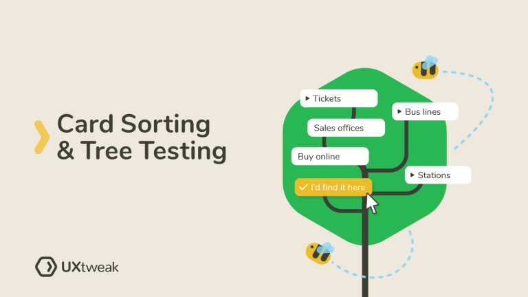
For example, this tree test for a bus company’s website asked participants to locate where they’d find the opening time for the ticket sales office within the website.

The user searched through the listed categories and subcategories to select the one they felt would contain the information they were required to find in the task.
UXtweak’s tree testing tool helps you create the website structure, screen participants, and analyze the data. It will help you determine how easy it is for people to find information within your website and learn where they get lost.
Types of taxonomy used in popular websites
Let’s look at some popular websites and how they organize their navigation for improved user experience.

Pinterest uses a very simple type of taxonomy known as flat taxonomy. Every category is listed horizontally at the top, and there’s not much depth to them.
ASOS

ASOS uses hierarchical taxonomy, the most common type among websites. We can trace the categories and subcategories to a single starting point. Information is grouped and labeled according to chosen similarities that make it easy for customers to shop for items.
Netflix

Netflix uses network taxonomy, which is also common among websites. This type of taxonomy organizes content into associative categories. So, although they may belong to different categories, there still exists a level of similarity among them. One example is Netflix’s ‘My List’, which contains different movie genres and types.
Yelp

Yelp is a good example of facet taxonomy, where an item can belong to multiple categories using its many associative taxonomies. For example, you can search for restaurants using different filters and still have a few of the same restaurants appear in the search results because they meet the criteria.
Information taxonomy in the design process
“A good taxonomy is typically a collaboration between UX designers, content strategists, information architects, marketing, and development folks.” – UX Booth.
Taxonomy in design is not limited to how websites and apps are presented to your users, but also has a role in how effective your work process is. From content management systems to design systems and research repositories, taxonomies make the design process easier for everyone.
Easy navigation equals a better user experience
By helping your customers spend less time and effort on finding what they need within your website, you are, in fact, making their lives easier and their experiences better.
Like Matt Rae, Design advocate at Adobe XD says, “the more granular your taxonomy is, the more specific a user’s search can be.”
So, if you are ready to improve your users’ searches, create an account at UXtweak and fine-tune your information taxonomy with the help of Card Sorting and Tree Testing today!